Overview
Our brief was to create a brand identity and typography for a brand of our choice. I chose a rental platform because finding an apartment to rent in the Philippines is hard, and I wanted to design for a problem I see around me.
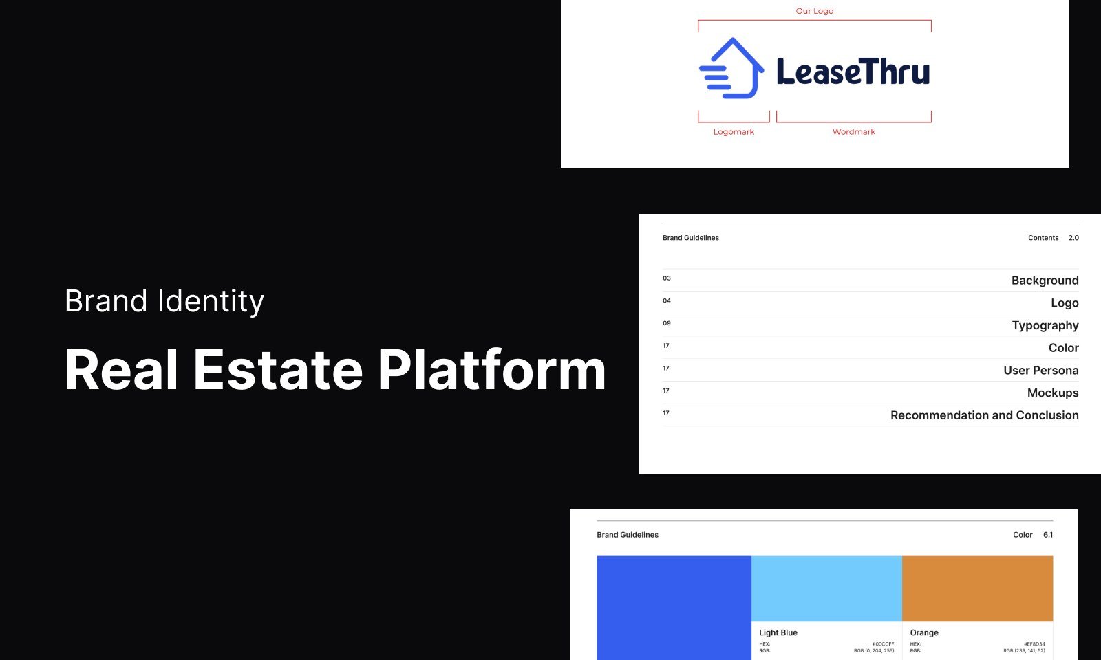
LeaseThru connects property owners with tenants and handles the work in between, from finding tenants to preparing their requirements. I built the brand from the ground up, with a logo, a custom typeface called Euphira, a colour palette, user personas, mockups, print ads and an audio-visual presentation.
The Challenge
Owners struggle to connect with good tenants, and tenants struggle to find a place they can trust. Renting involves money, contracts and strangers, so the brand had to earn trust quickly while feeling easy for very different people.
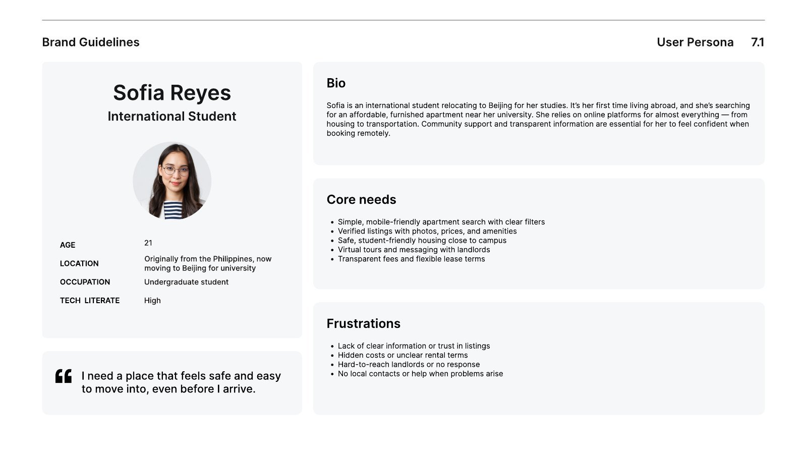
I wrote three personas to keep that range in view. Sofia is a student from the Philippines moving to Beijing. Daniel is a product manager relocating to Berlin. Mei Lin is a landlord who is less comfortable with technology and wants her listings full without hours of admin.
The Process
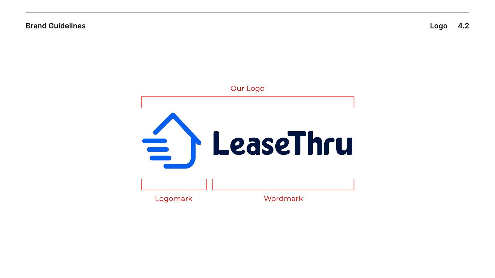
The logomark is a house drawn with speed lines, which signals a search that moves fast. It pairs with a bold wordmark and comes in horizontal, vertical and compressed versions, plus one-colour rules for print.
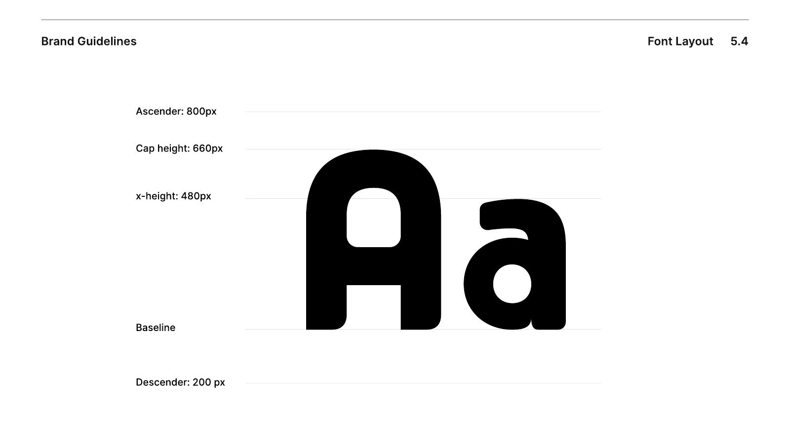
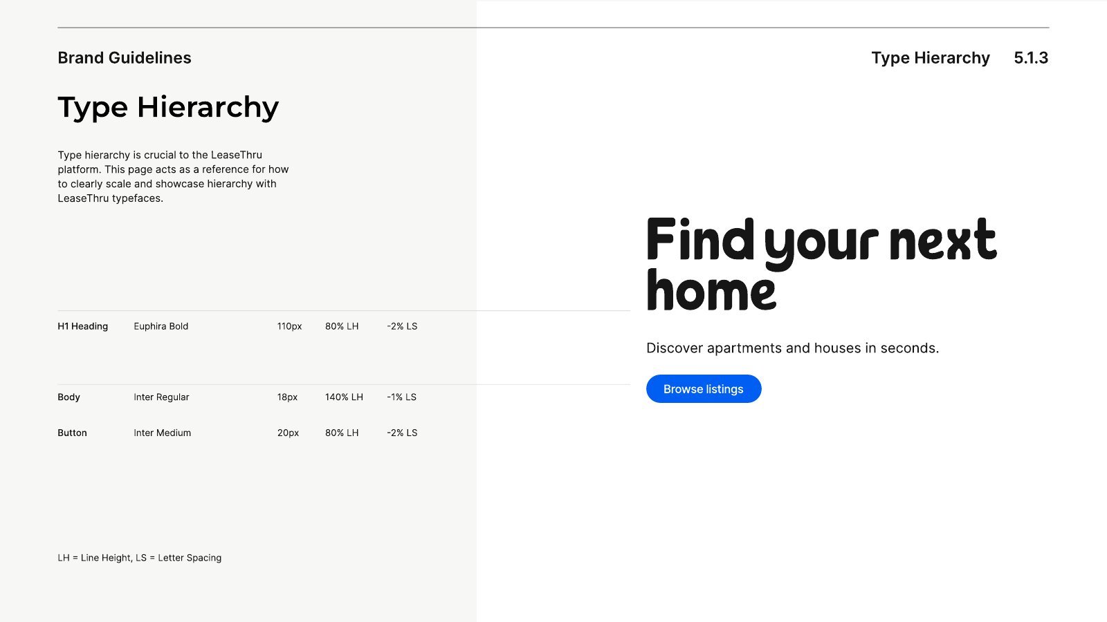
The typeface became the centre of the identity. I designed Euphira in FontForge in Regular and Bold, with soft curves, wide spacing and rounded terminals. Its name comes from Greek roots meaning to bring ease. Inter supports it for body text and buttons.
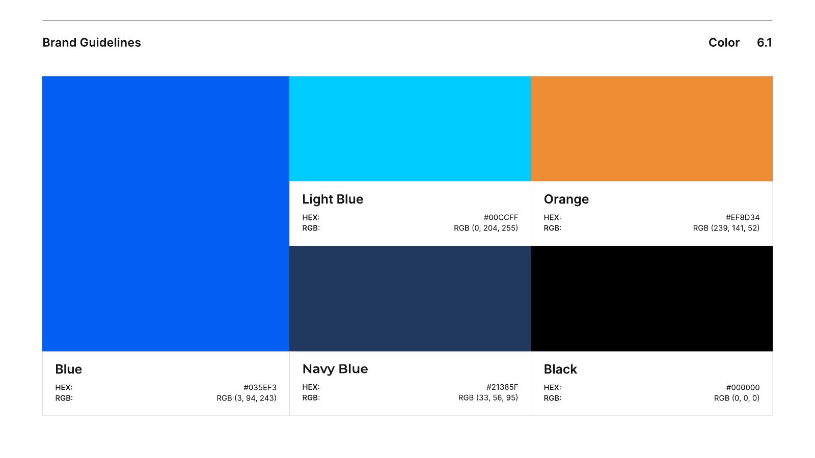
The palette leads with a strong blue, supported by light blue and navy, with orange as the warm accent. Stone and white keep interfaces calm.
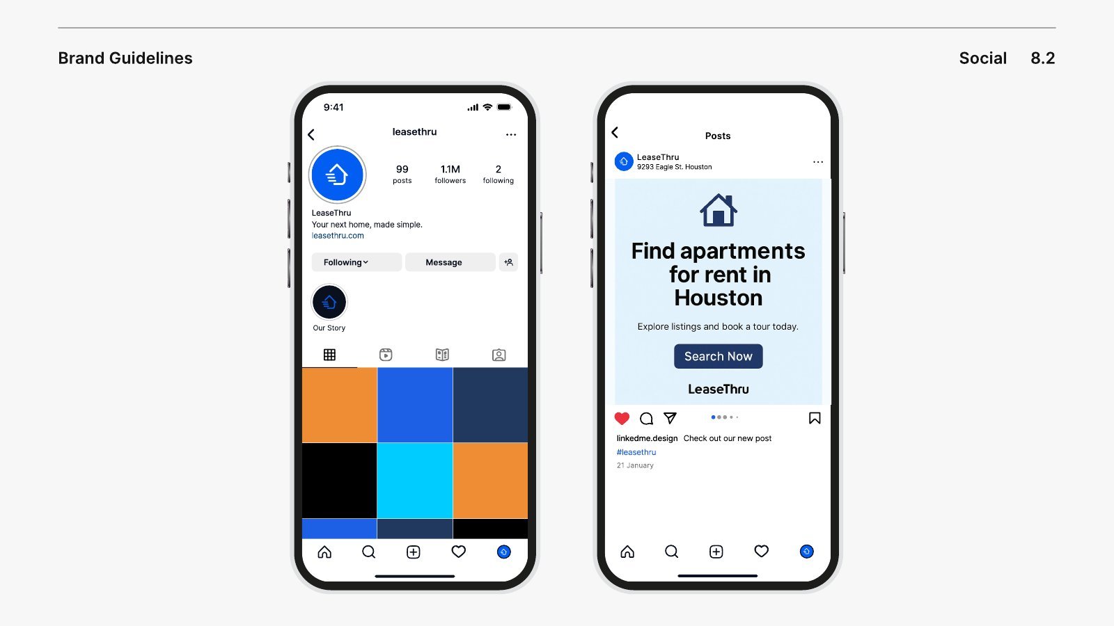
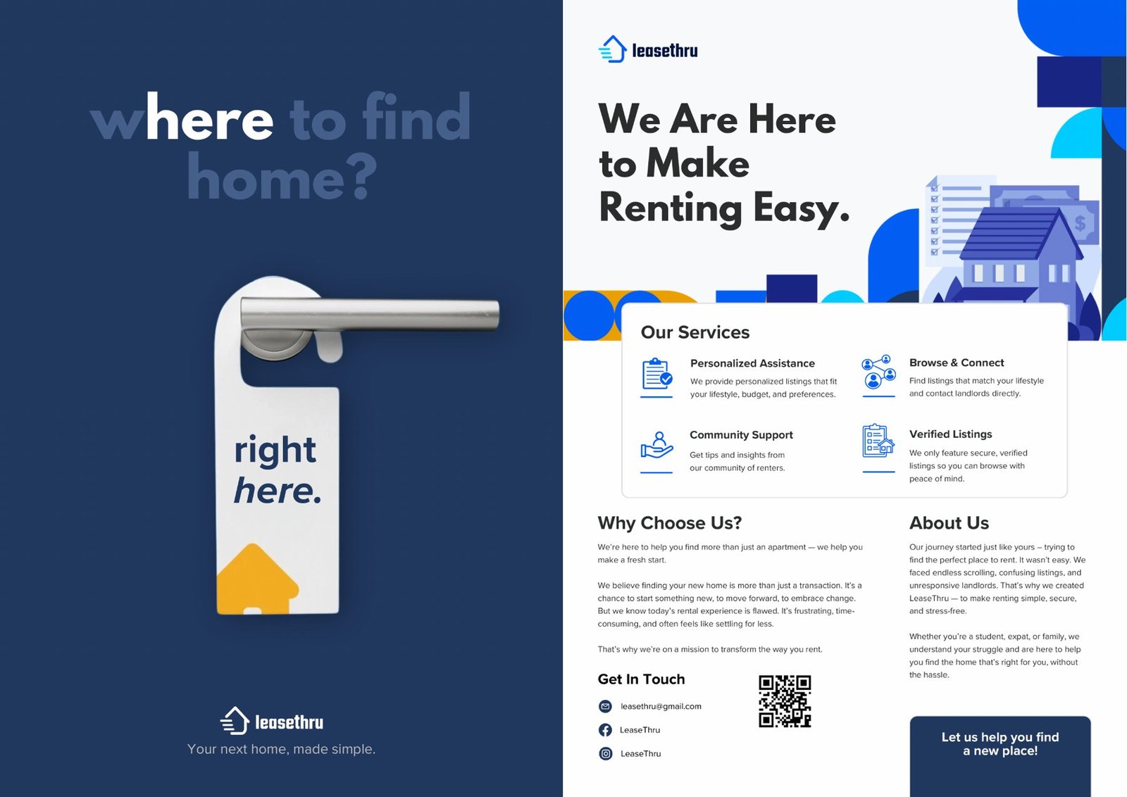
I tested the system on a business card, social profiles and outdoor print, then produced two print ads. One is a door hanger that answers where to find home with right here. The other is a flyer that explains the services.
Outcome
The final brand guidelines run to 36 pages and set out how to use the logo, Euphira, colour and type scale across every platform. The audio-visual presentation brings the brand together in motion.